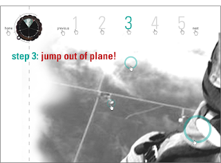
The mission of my website was to create a how-to that illustrated the feeling and spacial perspective of each step. This website is intended for those who are prospective skydivers. Through motion graphics and dynamic photos I aimed to give the user an illustration of the basic things that they would see, experience, and background information/tips they might need to know or simply want to know before they dive in to this experience. (hahah. pun intended.) My linear navigation is utilized through the altimeter stationed in the upper left hand corner of the page, as my non-linear is throught the colored circles in each step. This consistency through the circles in my non-linear navigation allowed me to again demonstrate a depth in the photograph, as well as pull out certain parts of the photo that pertained to the tid-bit. The color scheme mainly relies on each photo stationed in the altimeter for unification as well as contrast to the black and white photos.
...as a final note, i have a new found great appreciation for those who design for the web.... errrm.... those who design for the web WELL.
Friday, March 28, 2008
Friday, March 7, 2008
Wednesday, March 5, 2008
Tuesday, March 4, 2008
Subscribe to:
Comments (Atom)


